

О проекте:
В данном проекте мы уделили большое внимание работе с архетипами.
Главным архетипом парк-отеля является Маг, а дополнительным – Любовник.
Главным архетипом парк-отеля является Маг, а дополнительным – Любовник.
Маг символизирует трансформации, метаморфозы и преобразования. Изменяя себя, маг влияет на мир вокруг. Он стремится к достижению целей, используя законы природы. Его цель – превратить мечты в реальность, осуществить желания и установить связь с Вселенной. В дизайне мы подчеркнули этот архетип с помощью природных иллюстраций, выполненных вручную. Таинственность и загадочность мага мы передали благодаря изысканному темно-синему цвету, лежащему в основе стиля.
Любовник – это прежде всего о визуальном и эстетическом удовольствии. Они стремятся понравиться окружающим, выделяясь из толпы. Любовники хотят быть особенными и уникальными, вызывая восхищение. Они обращают внимание на красоту вокруг, чтобы все было приятно глазу. От архетипа Любовника мы взяли глубокий красный цвет и разработали утонченную и эстетичную полиграфию, которая выделяется не только своей функциональностью, но и изяществом.
About the project:
In this project, we paid great attention to working with archetypes.
The main archetype of the park-hotel is the Magician, with the Lover as an additional one.
The Magician symbolizes transformations, metamorphoses, and changes. By changing himself, the magician influences the world around him. He strives to achieve goals by using the laws of nature. His aim is to turn dreams into reality, fulfill desires, and establish a connection with the Universe.
In the design, we emphasized this archetype with hand-drawn natural illustrations. The mystery and enigma of the magician were conveyed through an exquisite dark blue color that forms the basis of the style.
The Lover is primarily about visual and aesthetic pleasure. They seek to please others, standing out from the crowd. Lovers want to be special and unique, evoking admiration. They pay attention to the beauty around them to make everything pleasing to the eye.
From the Lover archetype, we took a deep red color and developed refined and aesthetic branding materials that stand out not only for their functionality but also for their elegance.


Задача и решение:
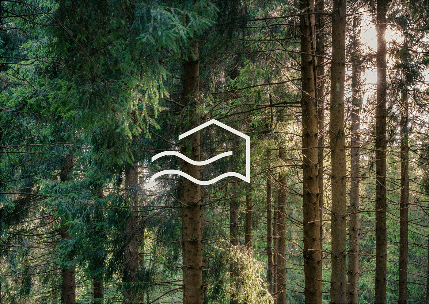
При создании логотипа был запрос на простоту и понятные ассоциации, поэтому мы не стали далеко ходить и взяли за основу образ дома и волны, так как глэмпинги в парк-отеле находятся у самого берега.
В рамках фирменного стиля был разработан дизайн визиток, евро-буклетов, навигационных табличек, баннера, подарочных сертификатов, табличек на двери и формы сотрудников
Task and solution:
When creating the logo, there was a request for simplicity and clear associations, so we chose to base it on the image of a house and waves, as glamping in the park-hotel is located right by the shore.
As part of the corporate identity, we designed business cards, euro brochures, navigation signs, banners, gift certificates, door signs, and employee forms.


